Introduction to Knobs
Knobs are dynamic tools in Widgetbook that allow you to modify the parameters passed to a use-case on the fly. They allow you to adapt and examine your widgets under various conditions and inputs, enhancing the overall understanding of a component's behavior.
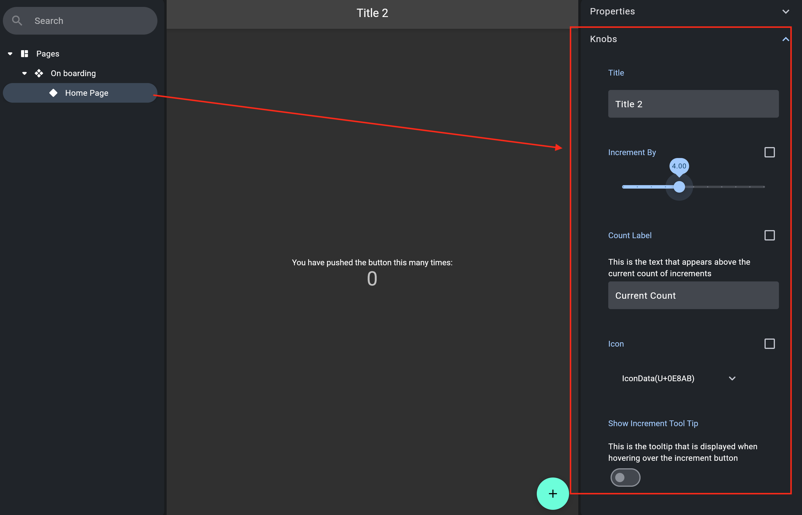
Usage
To incorporate knobs into your widgets, use the context.knobs function to access the
knobs builder:
Example: Knobs
import 'package:flutter/material.dart';
import 'package:widgetbook/widgetbook.dart';
import 'package:widgetbook_annotation/widgetbook_annotation.dart' as widgetbook;

import '../main.dart';

@widgetbook.UseCase(name: 'with different title', type: Container)
Widget myWidget(BuildContext context) {
  return MyHomePage(
    title: context.knobs.string(
      label: 'Title Label',
      initialValue: 'HomePage',
    ),
  );
}
Properties
Each Knob possesses a set of inherent properties to control its display in the Widgetbook's UI:
- label: A String that provides a title to the Knob. Each label must be unique for a WidgetbookUseCase.
- description: An optional String that explains the Knob's functionality. It serves as a form of documentation within Widgetbook, assisting your team members in understanding how to manipulate the Knob.
Available Knobs
| Type | Regular Knob | Nullable Knob | Multi-snapshot Support |
|---|---|---|---|
bool | boolean | booleanOrNull | BooleanKnobConfig |
int | int.input | int.input | IntKnobConfig |
int | int.slider | int.slider | IntKnobConfig |
double | double.input | doubleOrNull.input | DoubleKnobConfig |
double | double.slider | doubleOrNull.slider | DoubleKnobConfig |
String | string | stringOrNull | StringKnobConfig |
Duration | duration | durationOrNull | DurationKnobConfig |
DateTime | dateTime | dateTimeOrNull | DateTimeKnobConfig |
Color | color | colorOrNull | ColorKnobConfig |
T | list | listOrNull | ListKnobConfig |