Custom Knobs in Widgetbook
Widgetbook provides a versatile range of built-in knobs that help tailor widget behaviors on the fly.
However, sometimes developers may need to create a custom knob to meet specific requirements not addressed by the pre-existing knobs.
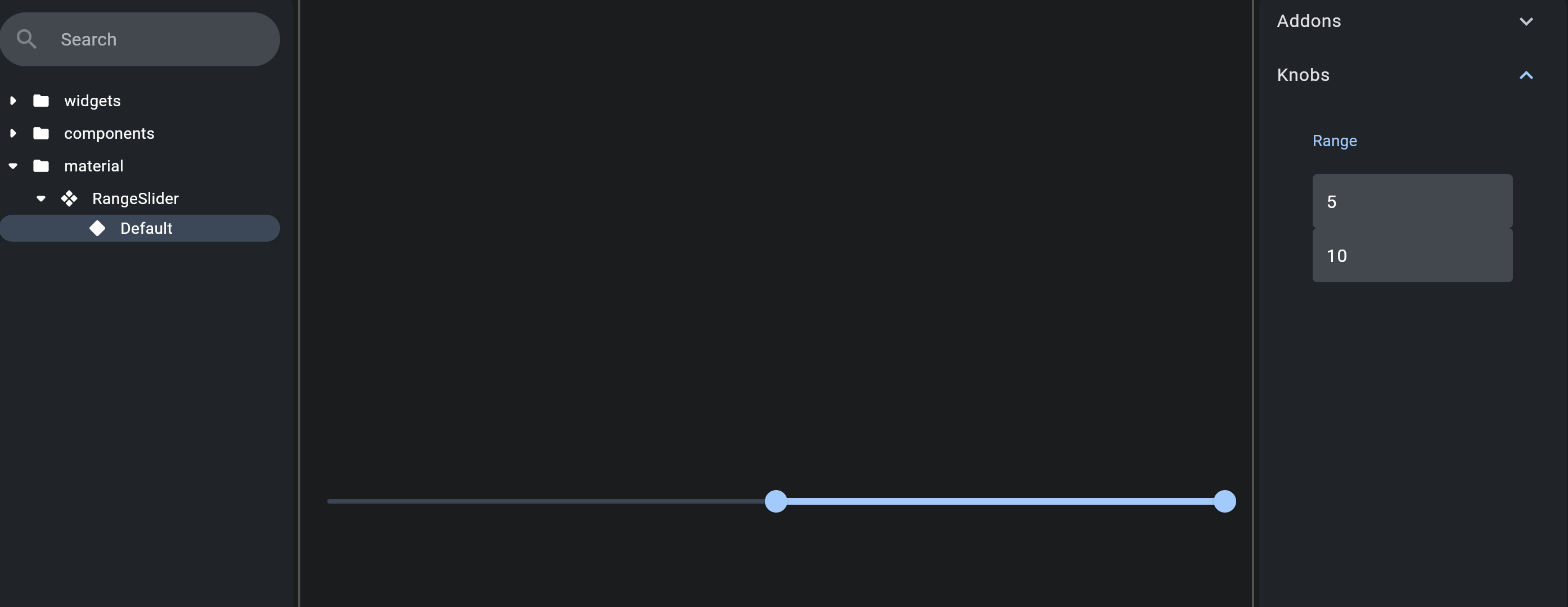
This document will look at how to create a custom knob in Widgetbook, using a
RangeSlider as an example. This widget allows you to select a range from a series of
values.
Creating a Custom Knob
To create a custom knob, you must extend the Knob class from the widgetbook package.
This class has a label and initialValue property. The label uniquely
identifies the Knob, and the initialValue holds the initial value of the Knob.
For our RangeSlider, we create a RangeKnob class that extends Knob<RangeValues>.
RangeValues is a class in Flutter that holds two double values - start and end,
representing the range.
class RangeKnob extends Knob<RangeValues> {
  RangeKnob({
    required super.label,
    required super.initialValue,
  });
  //...
}
Overriding Properties
The Knob class has several properties that can be overridden:
fields: This property should return a list ofFieldobjects that represent the different parts of the knob. For ourRangeKnob, we return twoDoubleInputFieldobjects representing thestartandendvalues of the range.
@override
List<Field> get fields => [
  DoubleInputField(
    name: 'min-$label',
    initialValue: initialValue.start,
  ),
  DoubleInputField(
    name: 'max-$label',
    initialValue: initialValue.end,
  ),
];
valueFromQueryGroup: This property is used to parse the value of the knob from a query string.
@override
  RangeValues valueFromQueryGroup(Map<String, String> group) {
    return RangeValues(
      valueOf('min-$label', group)!,
      valueOf('max-$label', group)!,
    );
  }
Using the Custom Knob
Now our custom knob, RangeKnob, is ready to be used. To use this knob, we create an
extension on KnobsBuilder. This extension includes a range method that adds our
RangeKnob to the KnobsBuilder.
extension RangeKnobBuilder on KnobsBuilder {
  RangeValues range({
    required String label,
    RangeValues initialValue = const RangeValues(0, 10),
  }) =>
      onKnobAdded(
        RangeKnob(
          label: label,
          initialValue: initialValue,
        ),
      )!;
}
This range method can now be used inside the widget to apply the custom knob:
import 'package:flutter/material.dart';
import 'package:widgetbook/widgetbook.dart';
import 'package:widgetbook_annotation/widgetbook_annotation.dart' as widgetbook;

@widgetbook.UseCase(name: 'CustomRangeSlider', type: RangeSlider)
Widget rangeSlider(BuildContext context) {
  return RangeSlider(
    values: context.knobs.range(label: 'Range'),
    max: 10,
    min: 0,
    onChanged: (_) {},
  );
}
And that's it! We have successfully created and used a custom knob in Widgetbook. This
knob can now be used to adjust the RangeValues in the RangeSlider widget directly from
the Widgetbook UI.
See source code
Limitations
It's important to note that you cannot create a custom Field, hence the use of two
DoubleInputFields for the RangeSlider. This limitation is due to the FieldType enum,
which should also be handled on the Cloud for Widgetbook Cloud users.
However, users can submit a request to create fields, and they will be managed and added by the Widgetbook team.
Field Types in Widgetbook
For more detailed information, visit the Field Types page.